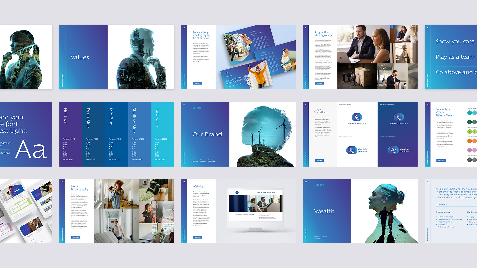
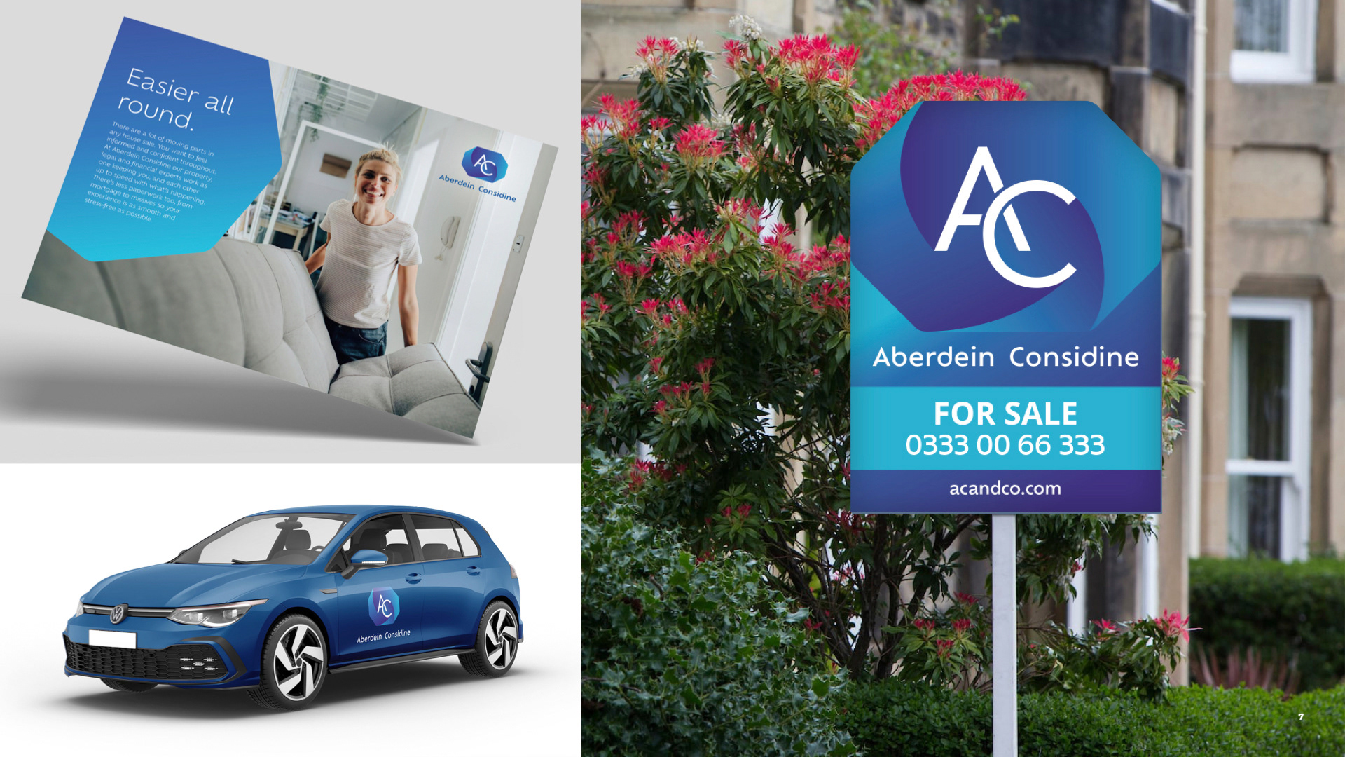
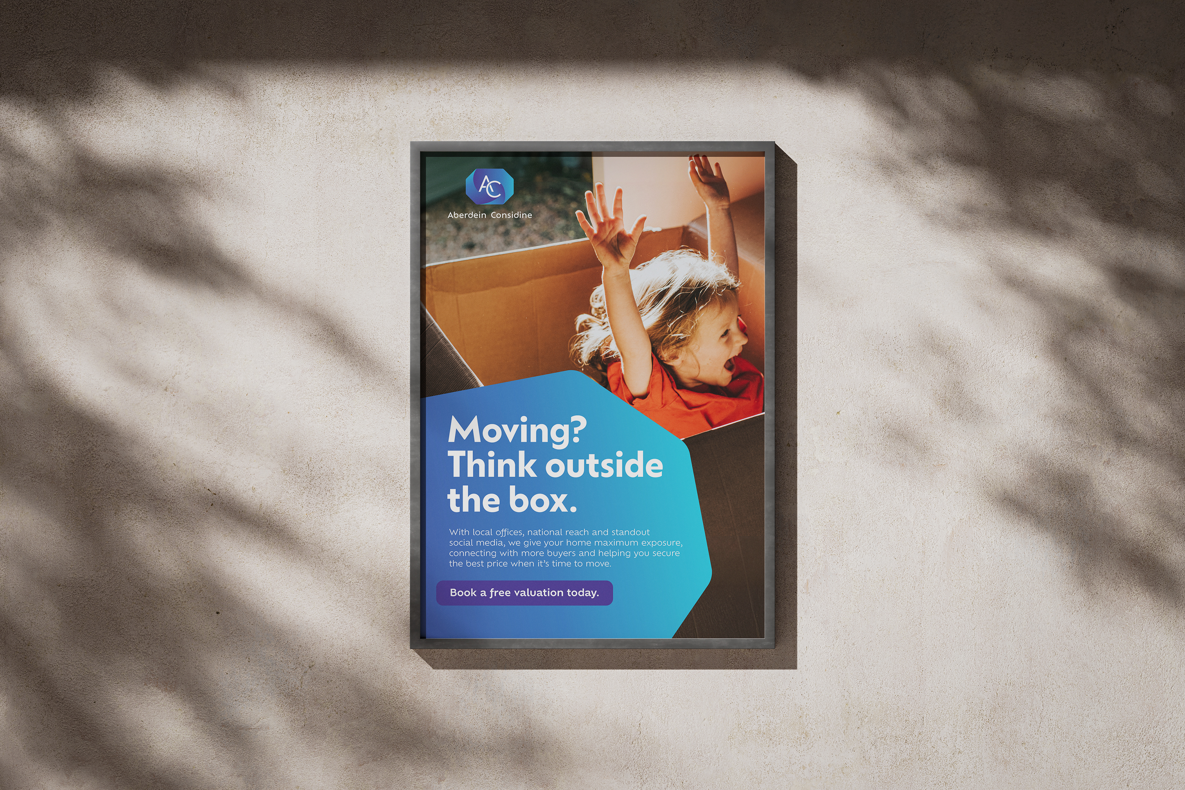
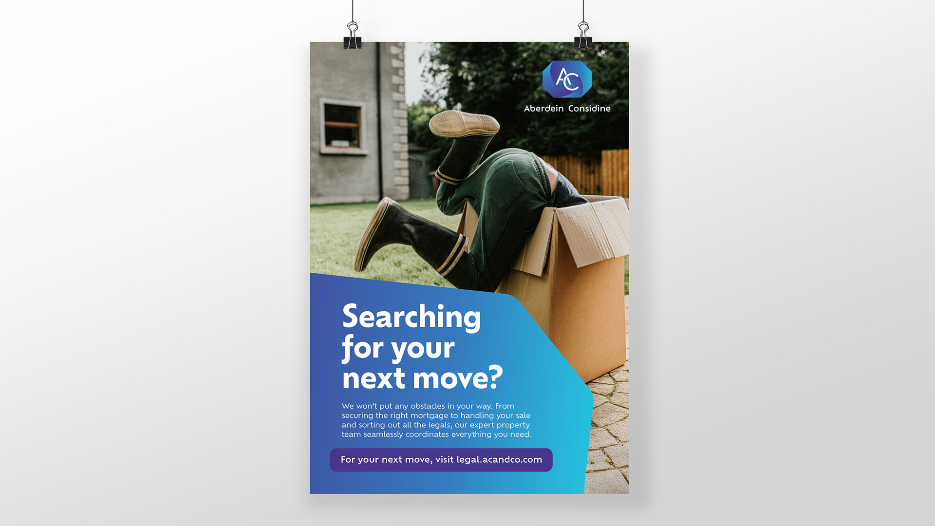
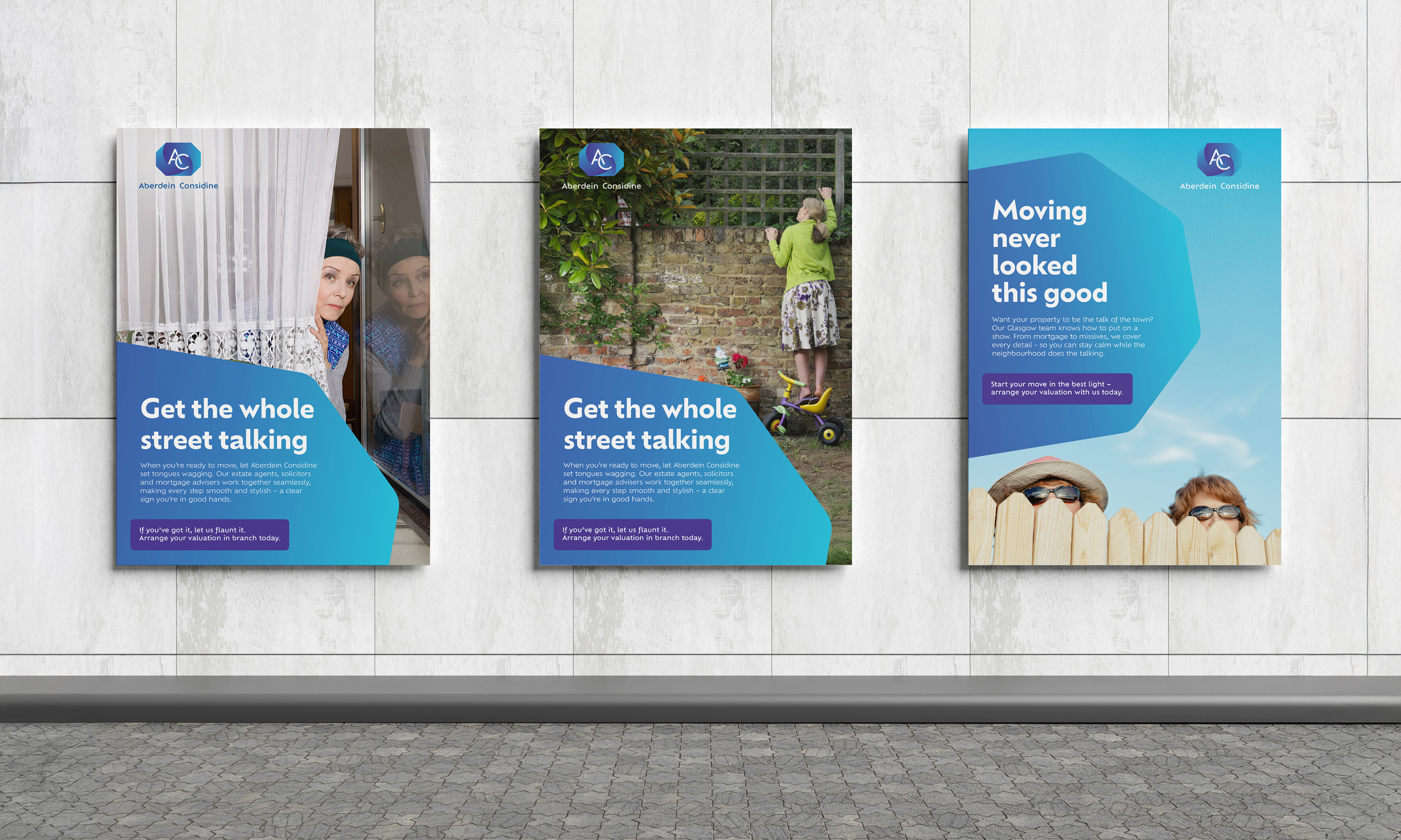
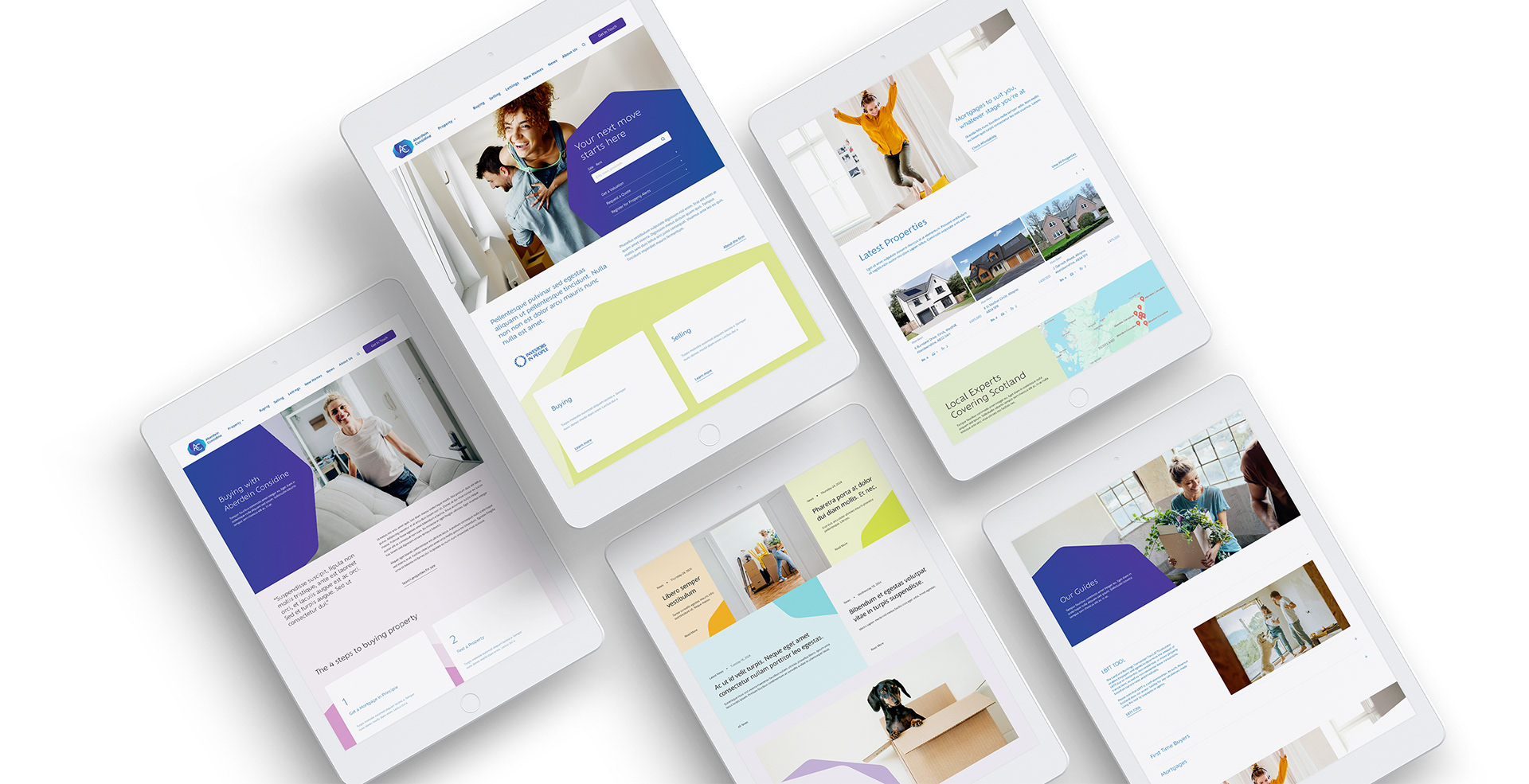
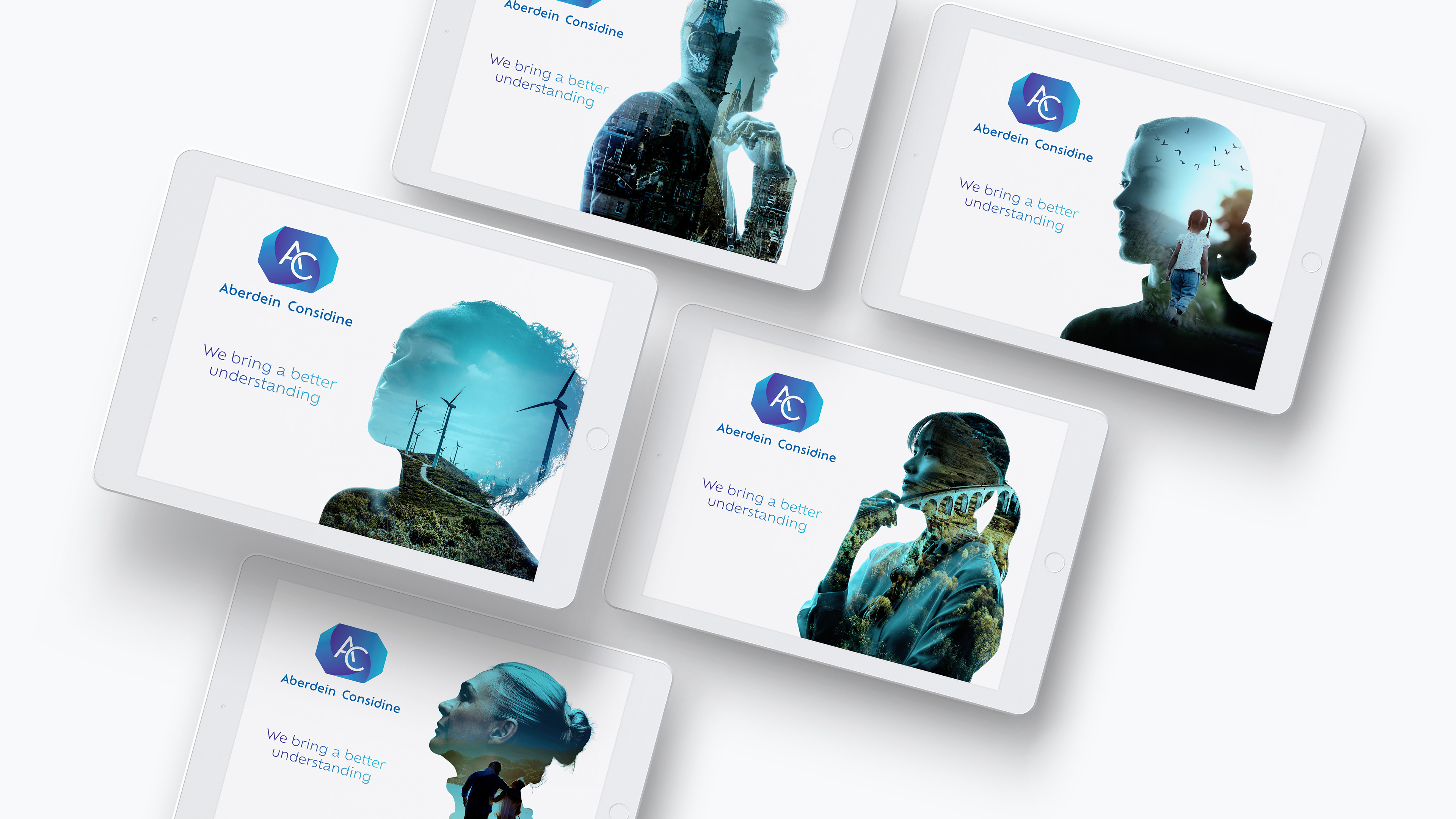
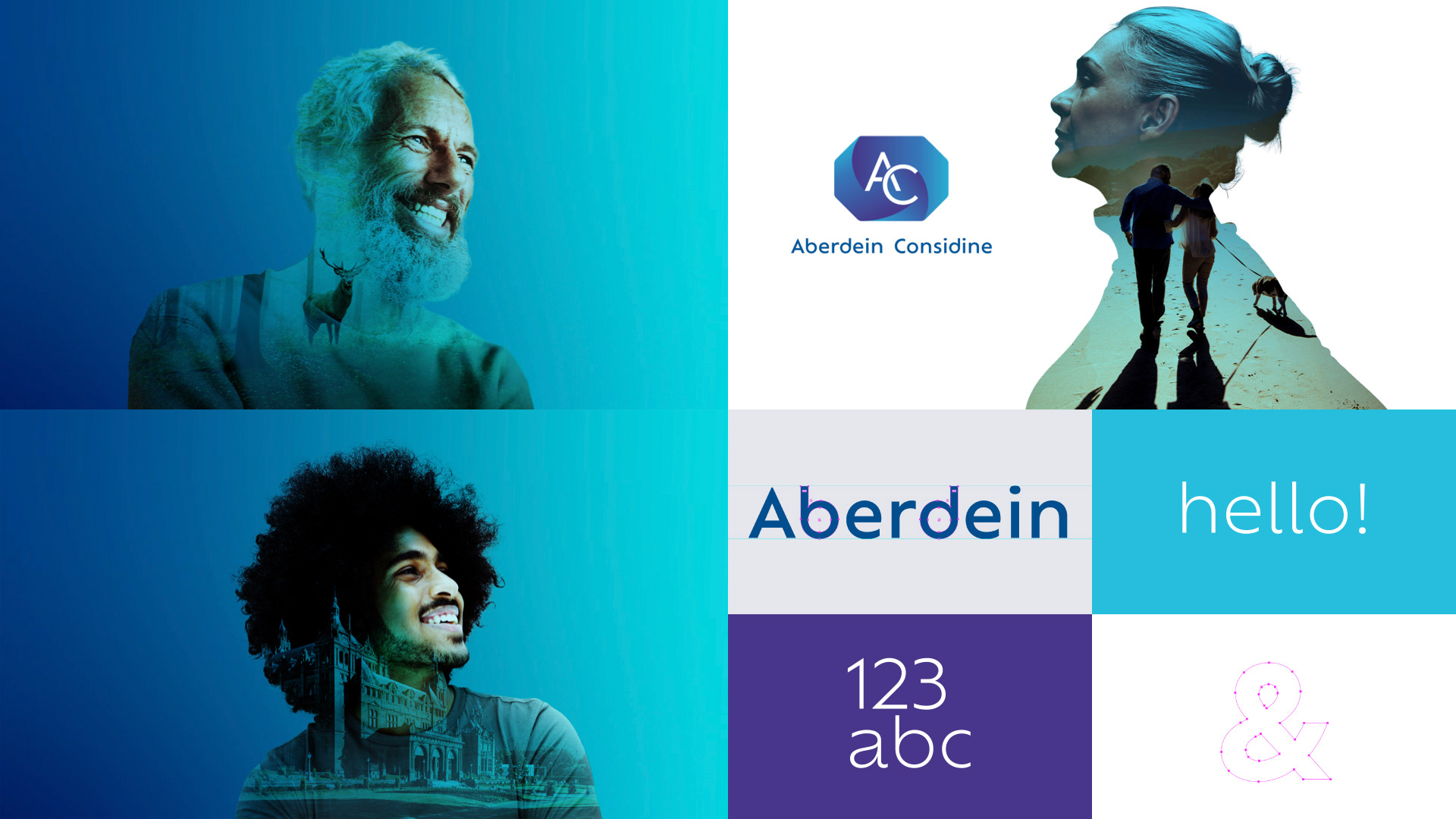
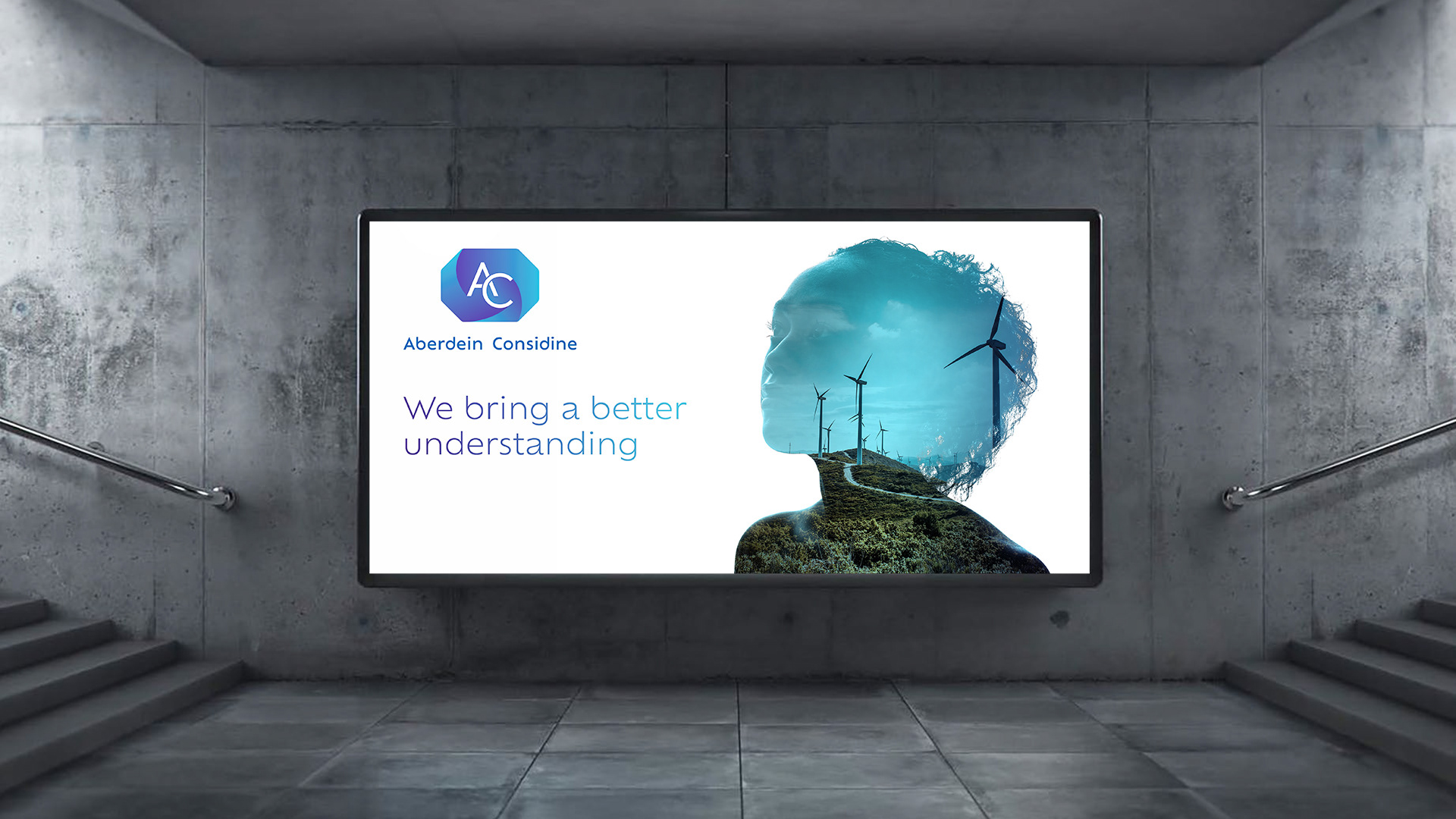
The previous Aberdein Considine brand was undeniably recognisable. It was memorable especially in the North East, but was ready for modernisation. This wasn’t a rebrand though, this was a refresh.
So, what have we done? We’ve taken a well established 40 year old logo and brought it into the 21st century with a modern look.
We’ve removed the old-world typeface and lost the white key-lines from the lozenge. We’ve rounded the corners and brought a sense of progressive movement with a cleaner, more contemporary monogram.
As a firm Aberdein Considine takes pride in being client-focused and progressive. They wanted their brand to reflect the energy and passion for the business that the people working within it have.
With this in mind the new typeface is modern, professional and friendly, the colour palette is vibrant and dynamic, and the gradients bring an injection of light, energy and movement.
They've put to one side the way they used to appear, and introduced a new look to all their communications to help them stand out from the crowd.
The brand has to engage different audiences across Property, Legal and Wealth sectors. So the way they look and the way they talk will flex a little.
This is not about losing their history, but building on their successes so they can move forward with confidence and look towards the next 40 years.
Back to Top